Regarding the tips from the book, I already have some familiarity with creating a well‑organized content hierarchy, for example by using heading tags from h1 to h6. This really makes a difference.
I also greatly appreciated the advice to seek quality typefaces in order to ensure legibility, professionalism, and to create an emotional impact, since the right font conveys the appropriate impression to the audience: seriousness, playfulness, sophistication, accessibility.
However, the tip that caught my attention the most was: Pair a serif with a sans serif.
The author explains that when selecting and combining typefaces, it is important to focus on two guiding principles: distinction and harmony. To maintain a clear and effective visual system, the fonts you choose should complement one another without clashing, yet still be distinct enough not to blur together.
He also notes that he would not pair two serif fonts like Caslon and Baskerville, since they share so many characteristics that most readers would hardly notice any difference. In that case, it is better to use just one of them, or even better, introduce a contrasting sans serif such as Museo Sans.
This is a principle I had not known before: fonts that are slightly different but still harmonious with each other. The result is an engaging, more intentional interface — and, why not say, beautiful.
Before reading this book, I only knew that typography either had serifs or not. But after exploring the content and examining typography more closely, I realized there is much more to it than just the presence of serifs. As you can see in the next image, every part of a typeface has its own role.
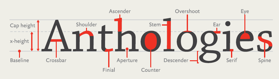
| Part of the Typeface | Definition |
|---|---|
| x-height | The height of the lowercase “x”; defines the proportion of lowercase letters. |
| cap height | The height of capital letters. |
| Crossbar | The horizontal stroke in letters such as “A”, “H”, and “e”. |
| Shoulder | The curved stroke in letters like “n”, “m”, and “h”. |
| Finial | The rounded or decorative end of a stroke. |
| Ascender | The part of a letter that rises above the x-height, as in “b”, “d”, “h”. |
| Aperture | The open space in letters such as “c”, “e”, and “s”. |
| Counter | The enclosed or partially enclosed space within letters like “o”, “p”, “a”. |
| Stem | The main vertical or diagonal stroke of a letter. |
| Overshoot | The slight extension of curved letters (like “o” or “s”) beyond the baseline or x-height to appear visually aligned. |
| Descender | The part of a letter that extends below the baseline, as in “p”, “q”, “y”. |
| Ear | The small projection on letters such as “g”. |
| Serif | The small decorative stroke at the ends of letter stems. |
| Eye | The specific counterform of the lowercase “e”. |
| Spine | The central curved stroke of the letter “s”. |
I also learned that it is necessary to use proper quotation marks to make the text more elegant. Curly quotes, usually called smart quotes, commonly look like filled-in 6s and 9s. Straight quotes, often called dumb quotes, are usually straight and vertical. You can see the difference on the page: https://smartquotesforsmartpeople.com/
After observing each typeface more carefully, as the author didactically guides the reader to do, I finally understood when a font is appropriate according to the context. I highly recommend reading this wonderful book.
Turn your reading into practice: get the book right now: On Web Typography - Jason Santa Maria